
SERVICE:
INDUSTRY:
Encore Community Services
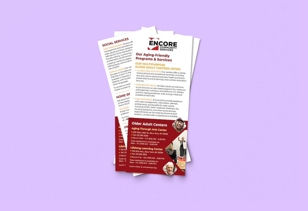
Encore Community Services needed a rack card containing information about their resources that could be comprehensive as well as easy-to-read.
ECS asked A Great Idea to create a visually attractive and content-dense rack card to help inform community members about their aging friendly programs, services, and resources.
AGI developed a design for the rack card that utilized visual hierarchy, typography, and color to clearly and cleanly communicate a lot of information about ECS’ programming.
For a rack card like this, we needed to be intentional with the design’s visual hierarchy and informational flow. This means that even while ECS’ rack card has a lot of information in a small amount of space, we used elements of design––like typography, color, and size––to guide viewers’ eye to the most important information first, without feeling overwhelmed or cluttered.
We know that rack cards need to be memorable and helpful or they will be skimmed and disposed of, so we pulled from our understanding of audience and community appreciation to clearly convey information to an audience in need of resources, better care, and more direct communication.
Our team brings a professional approach rooted in equity and deep listening to each project. When ECS came to us for this rack card, we took time to truly understand their team’s goals for developing this rack card, and used our skillset in design, branding, and communication to ensure our combined intention came across.
Put simply, print design is collateral design, meant for physical assets, while digital design is for electronic dissemination. Beyond that, there are differences in the designs we create for each channel. Considerations like text size, colors, and readability vary across formats.
Our team is composed of skilled designers, copywriters, and developers, meaning we can offer a range of design services! Most commonly, we offer custom brochure design services and promotional materials, annual report designs, marketing collateral design, brand design, environmental design, designs signage, and social media designs. Get in touch and let’s talk about your project!
Absolutely! We tend to work within existing brand guidelines. This helps ensure your materials feel like an extension of your brand.
While we don’t do in-house printing, we can help you get your materials printed! This includes having final printed materials sent to you or printed near you for pickup. In the design process, we ensure your files are prepared to be sent to printers by ensuring correct sizing, bleeds, and file packaging.